More people are accessing the internet than ever before. Many of them are doing so using multiple devices. In 2014, comScore published a study highlighting that mobile internet use had surpassed desktop use. Mobile users are now using their devices to do everything from accessing the internet and checking email to making purchases. There is no denying how far mobile technology has come and how commonplace its use is.
For businesses, this means that developing a mobile strategy is no longer a question of “should we?” but “how.” If you have any aspirations online, you have to account for the way users interact with their mobile devices and what their preferences are. All signs indicate that mobile is going to continue growing for years to come and so it’s important to prepare yourself – and your business – to succeed in this arena.
Making Your Website Device Agnostic
Of course, one of the best ways to start is by making your website as device-agnostic as possible. Essentially, what this means is that your site works well across all devices and requires no special considerations. Your website needs to load without any issues on not only desktops, but also tablets, smartphones and even newer devices like wearable technologies and smart televisions. So how can a website be built to meet these standards?
Enter Responsive Web Design (RWD).
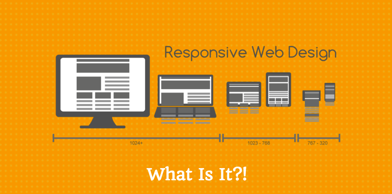
Understanding What Responsive Web Design Is
Responsive web design (or responsive design) is when sites are developed to respond to the behavior of users and their environments. It accounts for things like screen size, device orientation, operating system, browser and other variables that may change with a user’s preference. Websites built using RWD should function just as well on a user’s iPad or Samsung Galaxy as they would on a desktop – making the site totally accessible to the user regardless of how he/she is choosing to access the site.
Why Is Responsive Design so Important?
Responsive design is important for several reasons. Chiefly, it ensures that your site functions properly, regardless of the device a visitor may be using to access it. This ensures that your end users will always enjoy a smooth, consistent experience on your website, making them far more likely to return in the future. This certainly doesn’t hurt your chances of doing business with these end users!
One of the other benefits of responsive web design is that it means that you don’t have to maintain as much code on your site. In the past, mobile sites were built separately from desktop sites, meaning that they required a completely new set of code, especially for that device. Imagine the time that would take! With responsive design, it’s simply a matter of adding a few scripts and repurposing existing code rather than creating entire new sets. It’s a huge time-saver.
The other major benefit of responsive design is that it future-proofs your website. As you’ve probably noticed, new web-friendly devices are hitting the market all the time. And in no time, the market ends up flooded with competitors and then new version releases. It’s a lot to keep up with! Responsive design ensures that your site will be ready to meet these new devices head on!